

Project overview
The Delta Dental Mentorship Program is a 10-week UX/UI design immersive where students from San Francisco State University collaborated with researchers, designers, product managers, and developers from Delta Dental. During my second mentorship with Delta Dental, I led a team of 3 designers through the end-to-end design process, including heuristic evaluations, user interviews, affinity mapping, prototyping, wireframing, and usability testing.
The problem
Delta Dental members struggled to find dentists that matched their specific needs due to limited filtering capabilities, unclear interactions, and an outdated interface within the Provider Search Tool. Although filtering was a key feature, only 20% of users utilized it, leading to frustration, lower customer satisfaction, and increased support calls.
The solution
Our team redesigned the Provider Search experience by improving the filtering system, enhancing map interactions, and modernizing the interface. The new experience helped users more easily discover providers tailored to their needs through a clearer, more personalized search flow.

Heuristic Evaluation
The 10 heuristics are general principles for interaction design. These heuristics evaluates the usability of a website or product. To begin collecting initial problems on the current state of the provider search tool, our team conducted the 10 heuristic evaluations on the website.
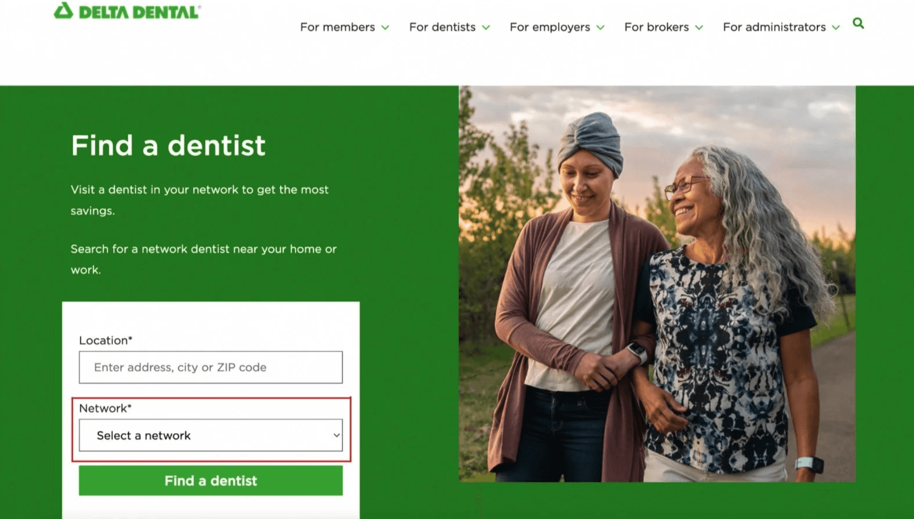
Heuristic #2: Match between the system and real world
When on landing page, users are prompted to enter their network. Certain users might not understand what this means, such as new users of Delta Dental.
Heuristic #3: User control and freedom
After the users decide to go back to the dentist list from the dentist’s profile they have to scroll endlessly until they find where they left off.

Heuristic #4: Consistency and standards
The map feature does not follow the standards of the maps users are used to such as apple maps or google maps. There is no way to indicate the distance from user location. There is also no way of transportation shown on the map for users commuting.

Heuristic #6: Recognition rather than recall
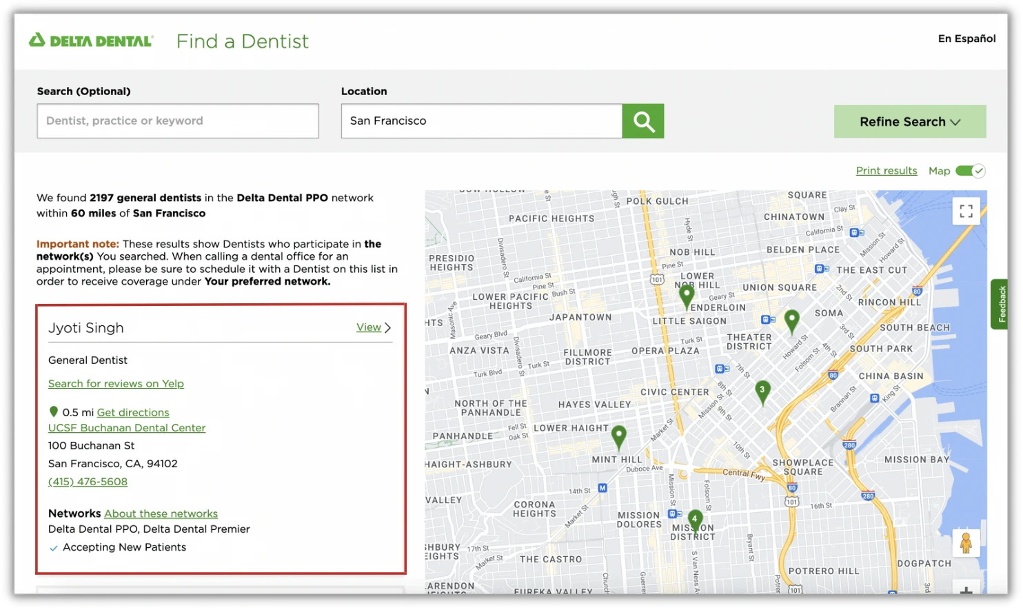
The dentist previews are all identical to one another and users are not able to identify which card is for which dentist. Users should not have to remember the full name of a dentist in case of leaving the site prematurely and should have a clear way to distinguish each dentist preview.
Heuristic #6: Recognition rather than recall
The refine search tool is not used by 20% of the online visitors. This is due to the fact that it currently has no recognizable level of important for the user flow of the product. It is simply a button on the top navigation bar with a lackluster UI design. Users are not motivated to navigate to this button along with the various filter refinements that are foreign to the user.

Hypothesis
Prioritizing the filter refinement feature in the top of the page, creating a more personal experience within the dentist + user, having an interactive map feature, and adding more visual emphasis on the interface of the product would ultimately increase the use of the provider search tool.
Therefore, it would also help users find a dentist that suits their needs and preferences which would result in less phone calls to the call center and lead to maximized customer satisfaction.
Preliminary Survey
To begin our research, our team created a preliminary survey for potential users that would use the provider search tool. To do this, our team created survey questions and imported these questions to a google survey document in order to maximize the data of information from the users. Based on our surveys we found out that:
Reviews are the first thing users want to see when looking for a new dentist
Being able to see what a dentist specializes in is very important
Finding the nearest dentist from home is crucial to reduce the time to get to the dental location
The user would like to see if the dentist can accommodate their disability immediately
Being able to filter the time is essential to the users so they can schedule a dental visit in between meetings or classes
User personas
Through our initial user surveys and data findings, we then created our user personas. The first persona is Aaron Lua, a college student who just moved to their college town in need of a new dentist. The second persona is Tara Harris, a pianist with a disability in need of a new dentist as well.


Ideation
Our team spent a lot of time conducting more research on our target users before ideation began. It was very important to us that our re-design of the platform served the different user groups while also making sure that the user experience was cohesive throughout using the features.

Through the process of creating an empathy map for the users, we had a much more clear idea of how to approach our initial wireframes. We began creating our crazy 8’s through Miro and wrote down everything we would think of building in the new re-design of the “find me a dentist” feature. Some ideation questions our team had during this process were:
How might we create a more personal experience for the user so that users who have a difficult time finding a dentist can feel more at ease?
How might we help the users narrow down their search for the best dentist by implementing a more refined filter search?
How might we arrange the map feature that grants more visibility to alternative methods of transportation to a dental office?
How might we rearrange the dentist preview information hierarchy so the user is able to gather the information they need at a glance?
Initial sketches
As a team, we first wanted to start the design exploration process by sketching out all of the different ideas we had to tackle the problems our user personas had such as changing the filter interface by adding it to the main navigation bar at the top of the page, changing the dentist preview interface and adding a reviews + profile photos of the dentists, adding an info button when having to choose your network when searching for a provider, and writing out interactions we wanted to implement into all of the wireframes when prototyping.


Delta Dental Emerald Design System
Before creating our first set of wireframes for the redesign of the provider search tool, we wanted to make sure to follow the design guidelines in the design system used by Delta Dental. Within the Emerald Design System, our team chose the components needed to complete the digital wireframes on Figma based on our sketches such as the drop down menus, radio buttons, and sliders.

Final Design Solution
Takeaway
This was my second mentorship program with Delta Dental and with the knowledge and experience from my previous program, I wanted to lead our team to success. This leadership role taught me more about the end-to-end design process since I facilitated every step for my fellow students in our team and made sure that by the end of the program we were all immersed in the skills needed for a successful UX design project. By the end of the mentorship, my group and I presented our final design process and work to all the stakeholders of the product where we received great feedback and design critiques.


