Project overview
During my internship at Cisco Systems (Summer 2022), I partnered with the Secure Workload team to design a reporting dashboard for the platform. This initiative was scoped by the product manager and served as a key project for my internship.
Over 12 weeks, I developed a strong understanding of the platform by collaborating with user researchers, technical writers, designers, engineers, and product stakeholders. This cross-functional environment enabled me to lead the end-to-end design process—from ideation and prototyping to delivering a final solution presented to stakeholders.
What is Cisco Secure Workload?
Cisco Secure Workload is a SaaS platform within Cisco’s network security suite. It enables security analysts and network administrators to detect anomalies, investigate threats, and respond quickly to protect systems. The platform uses zero-trust microsegmentation to secure applications across cloud and on-prem environments.

The problem
User research from the Cisco Secure Workload team revealed that users regularly manage five critical workflows—Workspace Overview, Agents, Connectors, External Orchestrators, and Clusters—spread across different areas of the platform.
Because this information is fragmented, users lack a centralized view to quickly assess system health and take action. As a result, they must manually navigate between workflows to identify and resolve issues, creating inefficiencies and slowing response times to potential security risks.

A design challenge emerged...
How might we create a more efficient way for the users of Cisco Secure Workload to resolve any ongoing security issues on the platform without having to check each key workflow page ?
Solution
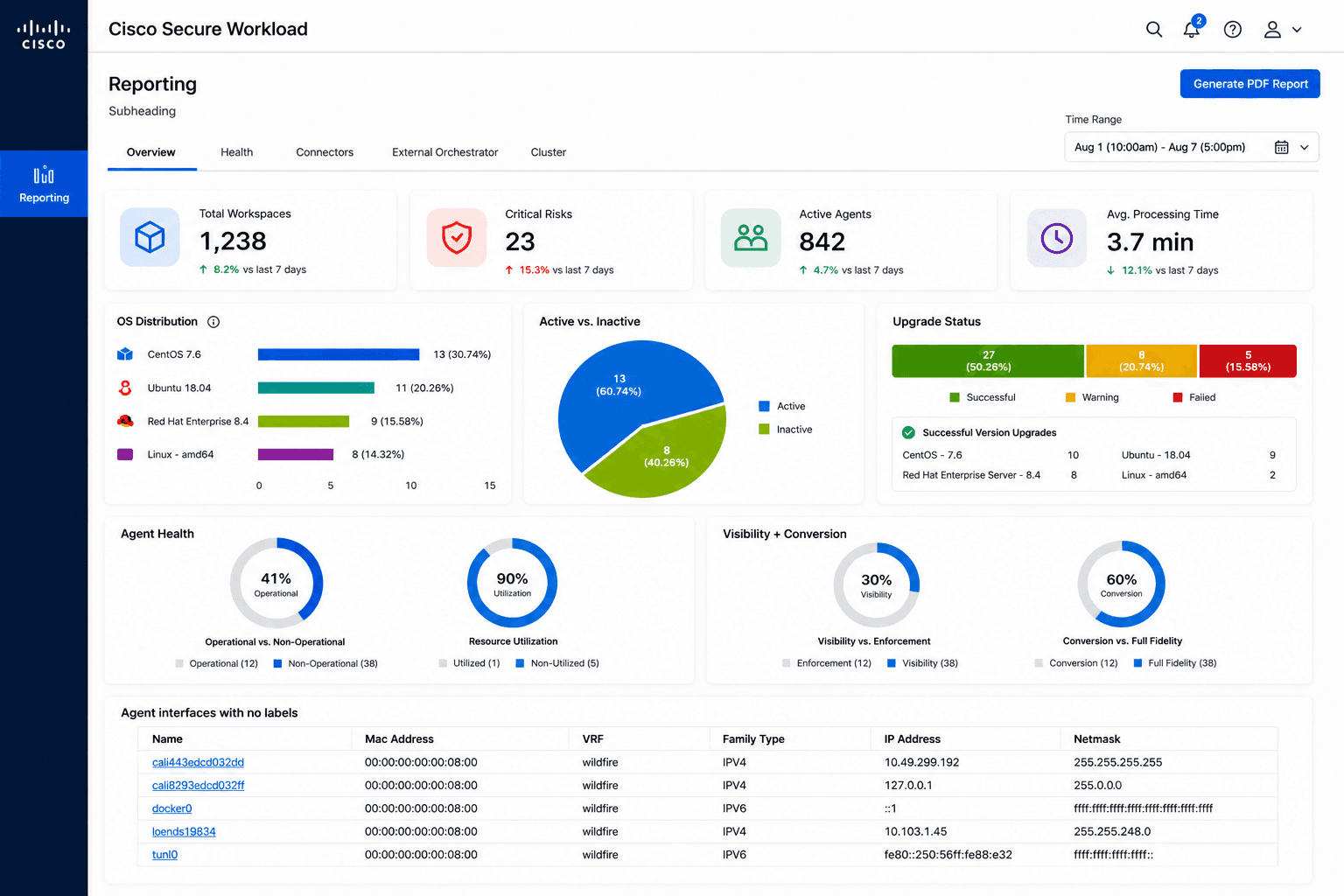
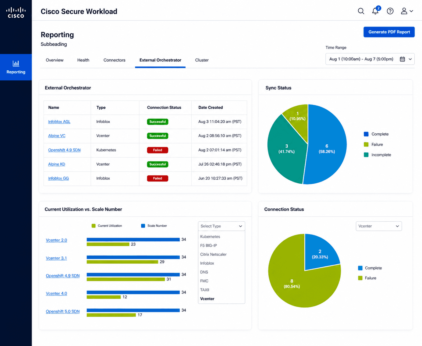
The Cisco Secure Workload Reporting Dashboard centralizes the status of five key workflows, giving users a unified view of system health.
The dashboard highlights critical insights across workflows and enables users to quickly identify and resolve anomalies. It includes a high-level overview of security data, along with structured sub-navigation that allows users to drill down into detailed information as needed.

Defining information architecture
In my initial meeting with the product manager at Cisco Secure Workload, I was given a spreadsheet outlining the roles and operators for the Reporting Dashboard.
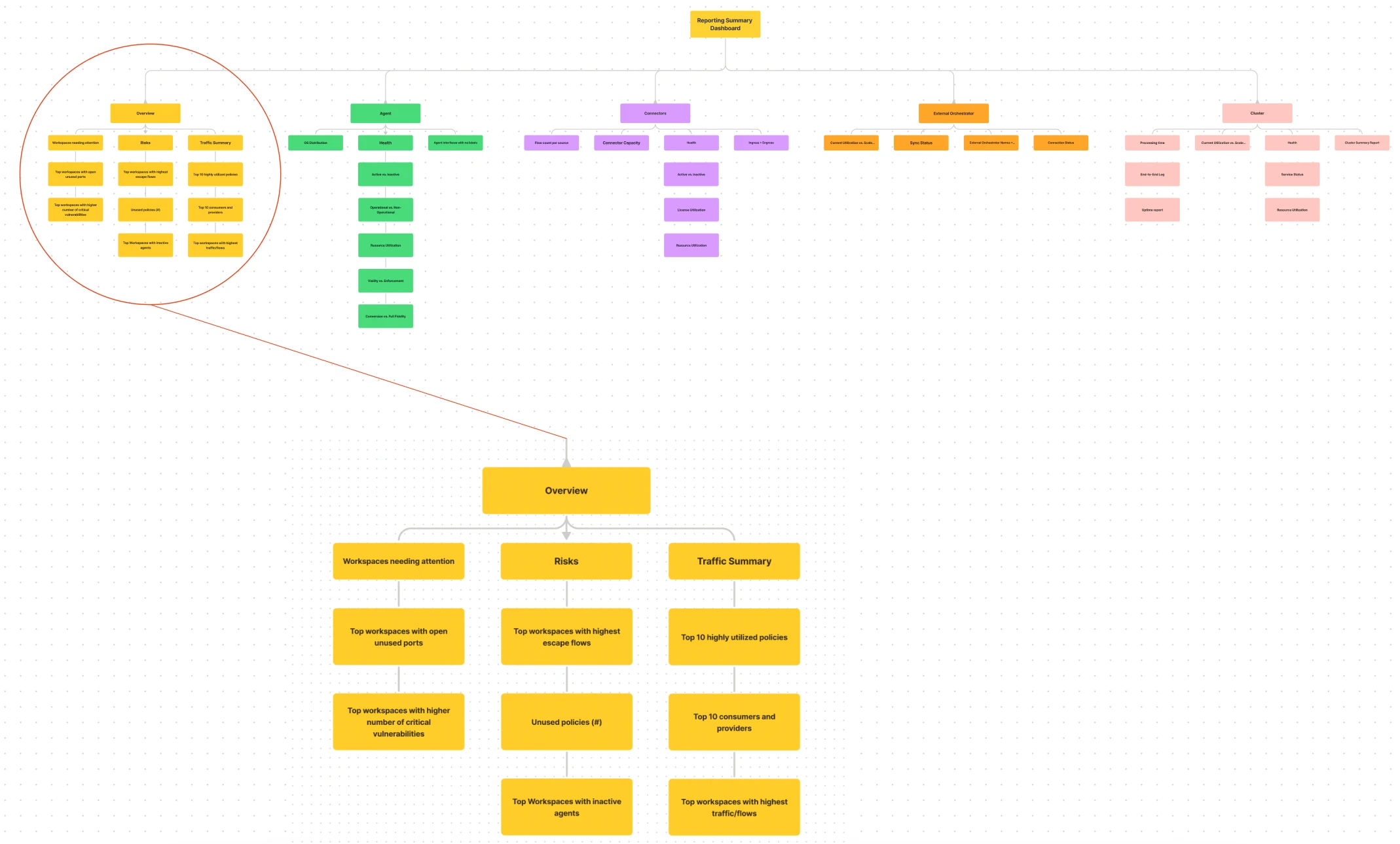
The main roles—Overview, Agents, Connectors, External Orchestrators, and Clusters—serve as the primary navigation. Each role contains operators that surface detailed system data within its respective tab.
For example, the Agents tab includes attributes like agent type, status (active/inactive), and operational health, with a consistent structure applied across all roles.

Site map construction
Before ideation, I reorganized the provided spreadsheet into a sitemap to better structure the roles and operators for the Cisco Secure Workload Reporting Dashboard.
To ensure technical accuracy and usability, I collaborated with a technical writer and engineer to translate the raw data into a clear, user-friendly structure that could guide the dashboard’s navigation and layout.
The personas
The user research team at Cisco Secure Workload played a key role throughout this project, providing insights into end users, product behavior, and feedback on my design iterations.
Prior to this work, the team had developed five core personas: Cam (Chief Information Security Officer), Sam (Security Analyst), Remi (Incident Responder), Kit (Network Administrator), and Nik (IT Administrator). These detailed personas helped me quickly understand user goals, pain points, and needs, which informed my design decisions throughout the project.


User journey
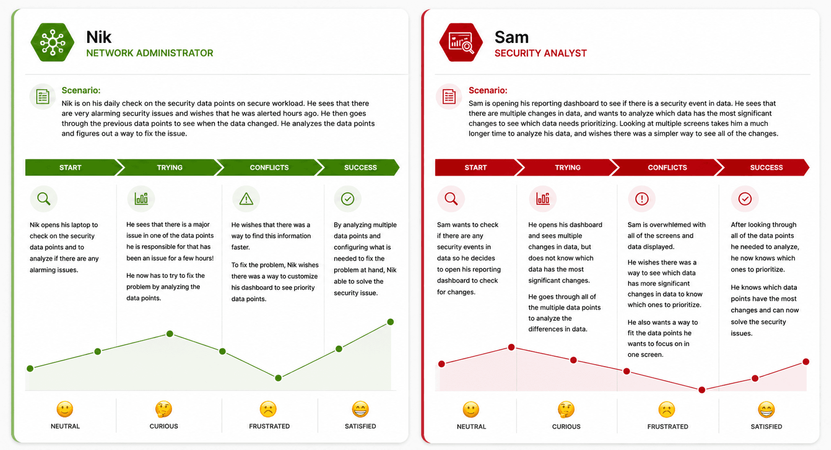
To better understand and empathize with users, I created journey maps for Sam (Security Analyst) and Nik (Network Administrator).
These personas were selected based on stakeholder input indicating they would be the primary users of the Cisco Secure Workload Reporting Dashboard, particularly when resolving data conflicts and monitoring network issues.
Affinity mapping
After researching users of the Cisco Secure Workload and creating personas and journey maps, I synthesized key findings before moving into design exploration.
I used an affinity map in Miro, organized into three sections, to group recurring themes and identify patterns across user needs and pain points.
Part 1: Gathering data from the persona cards provided by the user researchers of 5 main users of the secure workload dashboard: Remi, Nik, Sam, Kit, and Cam.

Part 2: Grouping the data based on themes and insights from all the users. This process gave me a much more clear idea on how I can approach the design explorations and what was truly important for the users.

Part 3: After grouping all of the themes from steps 1 and 2, I ideated 4 main pain points that needed to be solved for the user. These 4 main points were what I wanted to focus the design directives on throughout the multiple iterations of wireframes.

Ideation and understanding data types
Data visualization was a key focus of this project. I researched appropriate chart types using the product manager’s spreadsheet and sitemap, and collaborated with my design manager to align on best practices.
We mapped roles and operators to suitable formats, including bar, line, pie, and donut charts, along with list-based summaries for overviews.

Initial sketches
Before wireframing in Figma, I sketched initial layouts to explore how each data set would be displayed. During this phase, I continued researching data visualization and information architecture to ensure clarity and usability.
I regularly met with my design manager and product manager to refine the page hierarchy and validate my design decisions.

Final design for handoff
After many meetings with stakeholders, many interactive elements had to be removed from the dashboard such as the collapsable features or adding/removing data sets. There were many constraints, design critiques, and data given to me that I had to be altered before the final design.